improved
Reorganized settings
We’ve made a series of improvements to make finding settings more intuitive, and to reduce the number of links in the sidebar menu. Below is a summary of the updates we’ve made:
First,
the primary settings link has moved into the user dropdown menu
(in the top right). This has become a widespread industry convention, so it’s the first place many users will look for settings.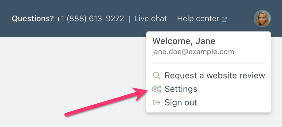
Next,
settings related to members & accounts have moved into the members section
. This keeps relevant settings close to the features they affect, and it mirrors the design pattern of our online payments section.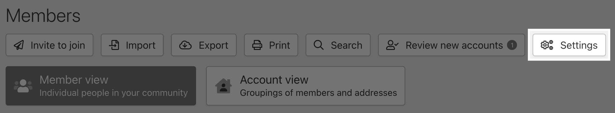
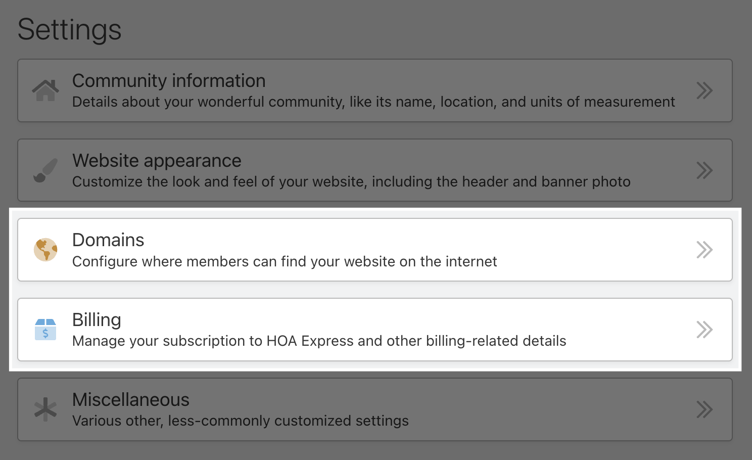
Finally,
billing and domains settings have moved into the primary settings
. These were formerly their own sections, but they are both more appropriately placed within the primary settings.